Data Visualization
- Home
- Data Visualization
Transforming Boring Data Into Interactive Reports With Data Visualization Services
Enhance data’s impact by leveraging data visualization services to transform boring information into interactive and engaging reports that derive insights and informed decision-making.


Why Is Globtier The Premium Choice of Businesses?
Unlock Hidden Patterns – Fuel Your Business With Our Data Visualization Services

Dashboard Development
Design dynamic dashboards that consolidate key metrics into one interactive interface. These dashboards empower stakeholders with real-time insights to drive smarter, faster decisions.

Data Mapping
Transform raw data into structured, relatable formats by mapping relationships and trends. This service ensures clarity and alignment across complex datasets for impactful analysis.
Infographic Design
Create visually appealing infographics that simplify complex information into compelling visual narratives. These designs enhance communication and engagement in reports, marketing, or presentations

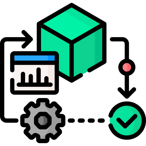
Custom Design Visualization Tools
Build tailored visualization tools that align with unique business goals, enabling organizations to interpret data seamlessly and enhance decision-making capabilities

Reporting and Presentation Services
Develop polished, professional reports and presentations that combine analytics with captivating visuals. These services help to effectively convey insights to teams and stakeholders.

Interactive Visualization
Implement interactive tools like heatmaps and drill-down charts to encourage hands-on exploration of data. This fosters deeper engagement and unveils hidden insights

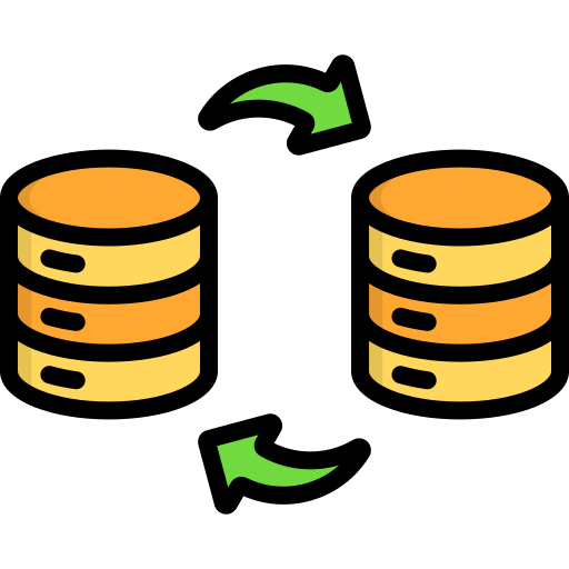
Data Integration and Transformation
Aggregate and transform data from diverse sources into consistent formats for analysis. This service ensures unified datasets, enhancing overall data quality and accessibility

Training and Consulting
Provide expert training and guidance to empower teams with visualization skills. Consulting services align visualization strategies with business objectives, ensuring maximum value.

Tool Implementation
Seamlessly integrate industry-leading visualization tools into business processes. This service streamlines workflows and elevates data analytics capabilities
Visualization Strategy Development
Create tailored visualization strategies that align with organizational goals. These strategies help businesses harness data to drive innovation and gain a competitive edge.
Transform Data Into Visually Engaging Reports
Data visualization services transform raw data into visually engaging reports by employing various techniques such as charts, graphs, maps, and interactive dashboards. These services organize and present complex information in an easy-to-understand, aesthetically pleasing manner, making it accessible to a wide audience. The goal is to enhance data comprehension, identify patterns, trends, and outliers, and ultimately facilitate data-driven decision-making. This visual approach not only improves data accessibility but also boosts its impact, enabling businesses to communicate insights effectively and drive informed actions.


Storytelling
Visuals help create compelling narratives around data

Faster Analysis
Data visualization accelerates the data analysis process

Identify Trends
Visualization helps spot trends and patterns that might be hidden in raw data

Actionable Insights
Visualizations often lead to actionable insights that drive business improvements

Data Quality Assessment
Visualizations can highlight data inconsistencies or errors

Increased Engagement
Engaging visuals capture and maintain audience interest

Enhanced Understanding
Data visualization simplifies complex data, making it easier for people to grasp and interpret

Improved Decision-Making
Clear visuals enable quicker, more informed decisions

Competitive Advantage
Leveraging data visually can provide a competitive edge in various industries

Efficient Communication
Visual reports facilitate data sharing and collaboration across teams and stakeholders
Frequently Asked Questions
Q1. What are data visualization services?
Q2. What are the four types of data visualization?
The primary categories of data visualization include:
- Charts: Includes bar charts, pie charts, line charts, and histograms. These are commonly used to compare values, show trends over time, or display proportions.
- Graphs: Visualize relationships between data points, such as in scatter plots or network graphs, often used for statistical and relational analysis.
- Maps: Geospatial visualizations, like heatmaps and choropleth maps, represent data tied to geographical locations, ideal for regional or demographic analysis.
- Dashboards: Combine multiple visual elements like charts and tables into an interactive interface, providing a comprehensive view of key metrics and performance indicators in real-time.
Q3. What are the 3 C's of data visualization?
The 3 C’s of Data Visualization refer to Clarity, Context, and Creativity, which are critical for creating impactful visual representations of data:
- Clarity: Ensures the visualization is easy to interpret, free from unnecessary complexity, and presents data in a straightforward manner for the audience.
- Context: Provides relevant background information, labels, and legends to help viewers understand what the data represents and how it relates to the subject matter.
- Creativity: Incorporates innovative and visually appealing designs to engage the audience while ensuring the visualization effectively communicates the data’s insights.
Together, these principles make data visualization effective, meaningful, and engaging.
Q4. What are the 5 steps in data visualization?
The five steps in data visualization are:
- Define Objectives: Clearly identify the purpose and goals of the visualization, focusing on what insights need to be communicated to the target audience.
- Collect and Prepare Data: This step involves sourcing relevant data, cleansing it to eliminate errors or inconsistencies, and organizing it into a structured format suitable for analysis.
- Choose the Right Visualization Tools: Select tools and visualization types (e.g., charts, graphs, dashboards) that best represent the data and suit the audience’s needs.
- Create the Visualization: Design the visual representation with a focus on clarity, context, and aesthetics, ensuring it effectively conveys the intended insights.
- Analyze and Iterate: Review the visualization for accuracy and relevance, gather feedback, and refine it for better communication and impact.
These steps ensure the visualization effectively supports decision-making and storytelling.